The following pictures show how we got to our final designs.
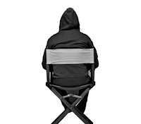
This is the original picture that we took, the idea behind the picture was a man sat in a lonely room and this relates back to the song lyrics. We needed to edit this image to make it look more like an album cover, whilst editing this album cover we used the Arctic Monkeys - "Whatever People Say I Am, That's What I'm Not" album as inspiration, this album is has a simplistic design when the main image on the cover is a man smoking a cigarette.
First of all we had to cut the edges off the image, by this I mean we had to get rid of the unnecessary items on the floor in the picture. We really only wanted to have the man in the chair and nothing else in the background. To select the man in the chair we used the ‘Magic Wand’ tool on Photoshop, after doing this we put a white background behind the image of the man in the chair.
After doing this we thought the image looked too plain, so we decided to put a drop shadow on the image to give the cover more depth, it also makes the image of the man in the chair stand out more.


No comments:
Post a Comment